
Plover Coffee Roasters Branding
Brand Identity, Packaging, social media | 2025Plover Coffee Roasters is a vision for a coffee shop and roasters on the Sonoma County coast. This branding concept highlights their locale-based focus, using educational blurbs, visuals of local fauna, and an inviting tone to lure in local nature enthusiasts and adventurous visitors alike.

Process
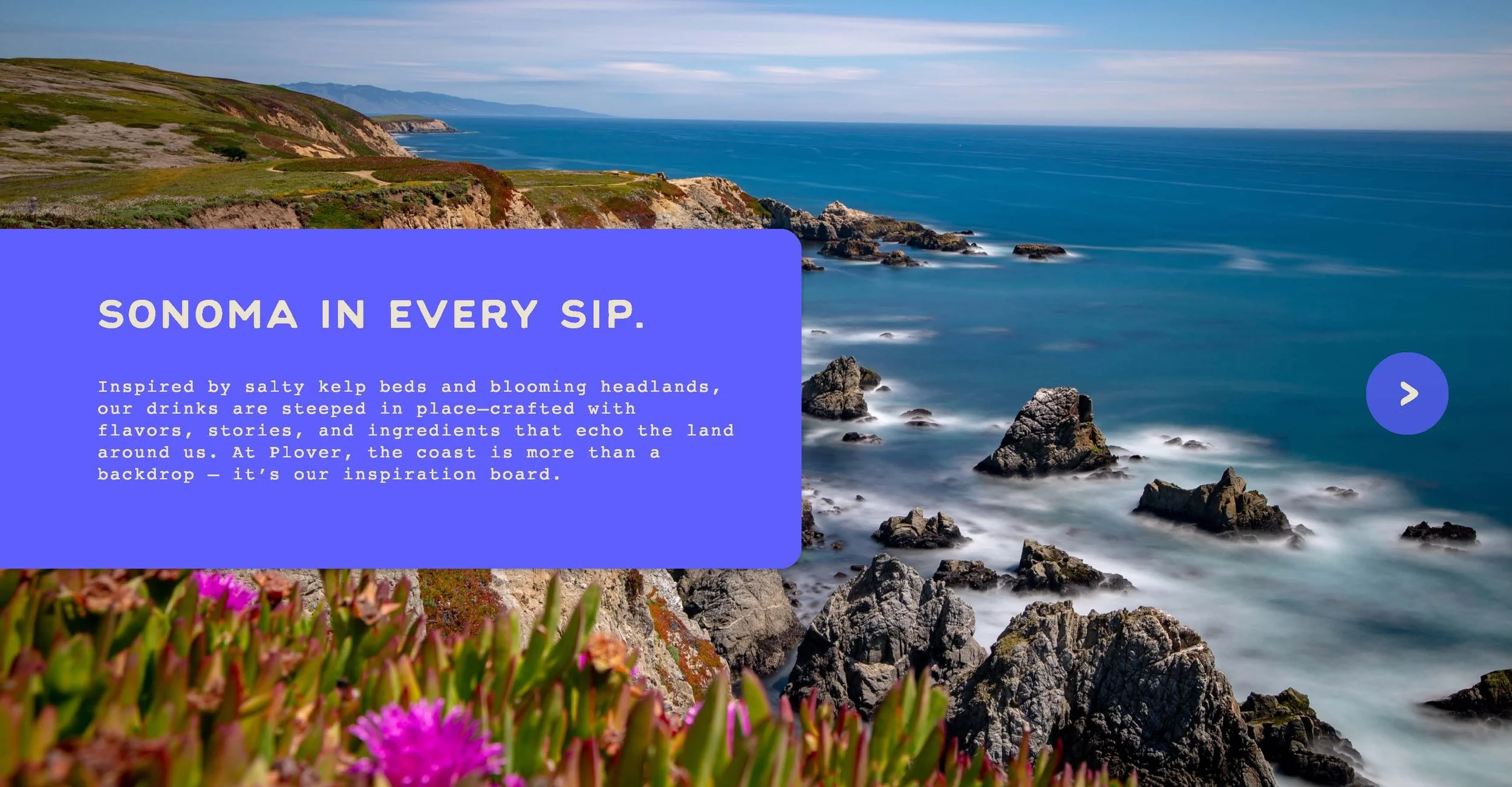
Surveying the local lands for natural inspiration.
This project involved creating an entire brand identity. The deliverables include basic visual assets (such as logo, wordmarks, and a pattern) as well a variety of adaptable packaging mockups and web templates.
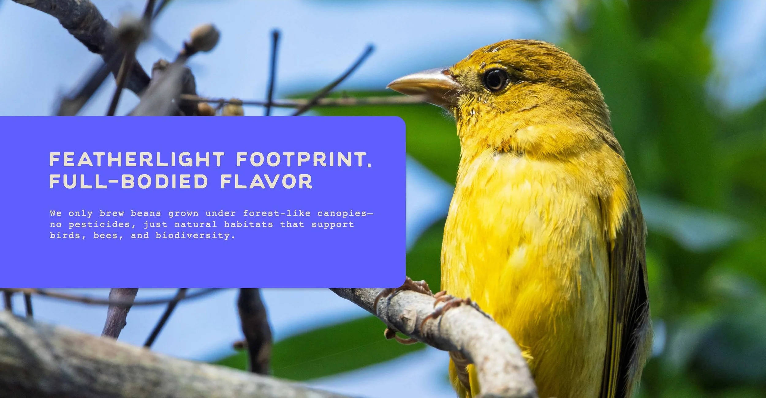
Considering Plover’s focus on natural environment and and the encouragement of exploration, the visuals needed to look both organic and approachable. For a sense of the local landscape, I visited the coast, researched the wildlife, and poured over images of the Sonoma County area.
The target market for this coffee shop includes nature-loving folks from all walks of life. This might be a dedicated hiker stopping for a caffeine boost, or a family looking for a spot to rest amidst a day of excursions. The goal is to bring any and all environmentally-inspired folk through the door.
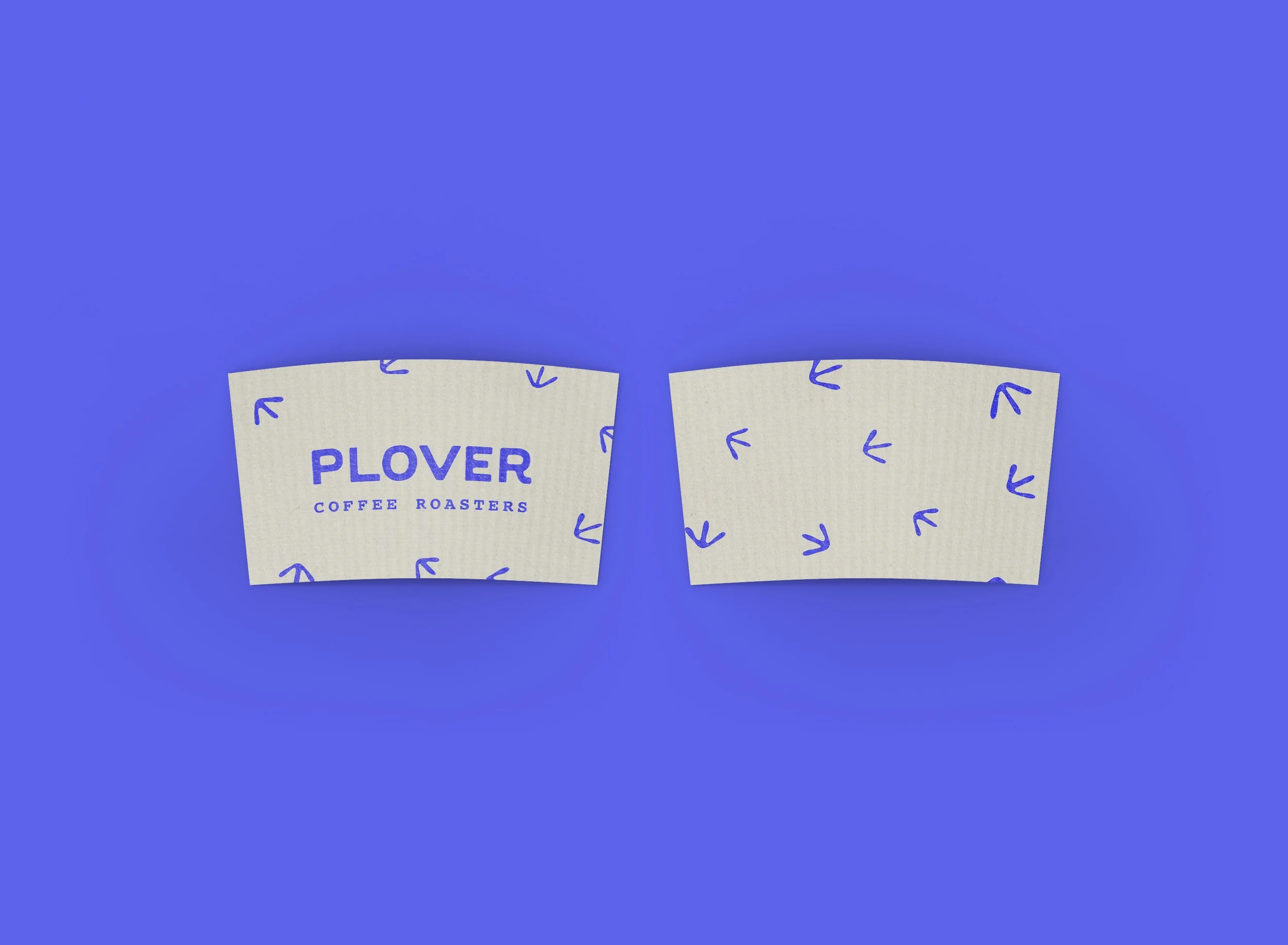
Visual Assets
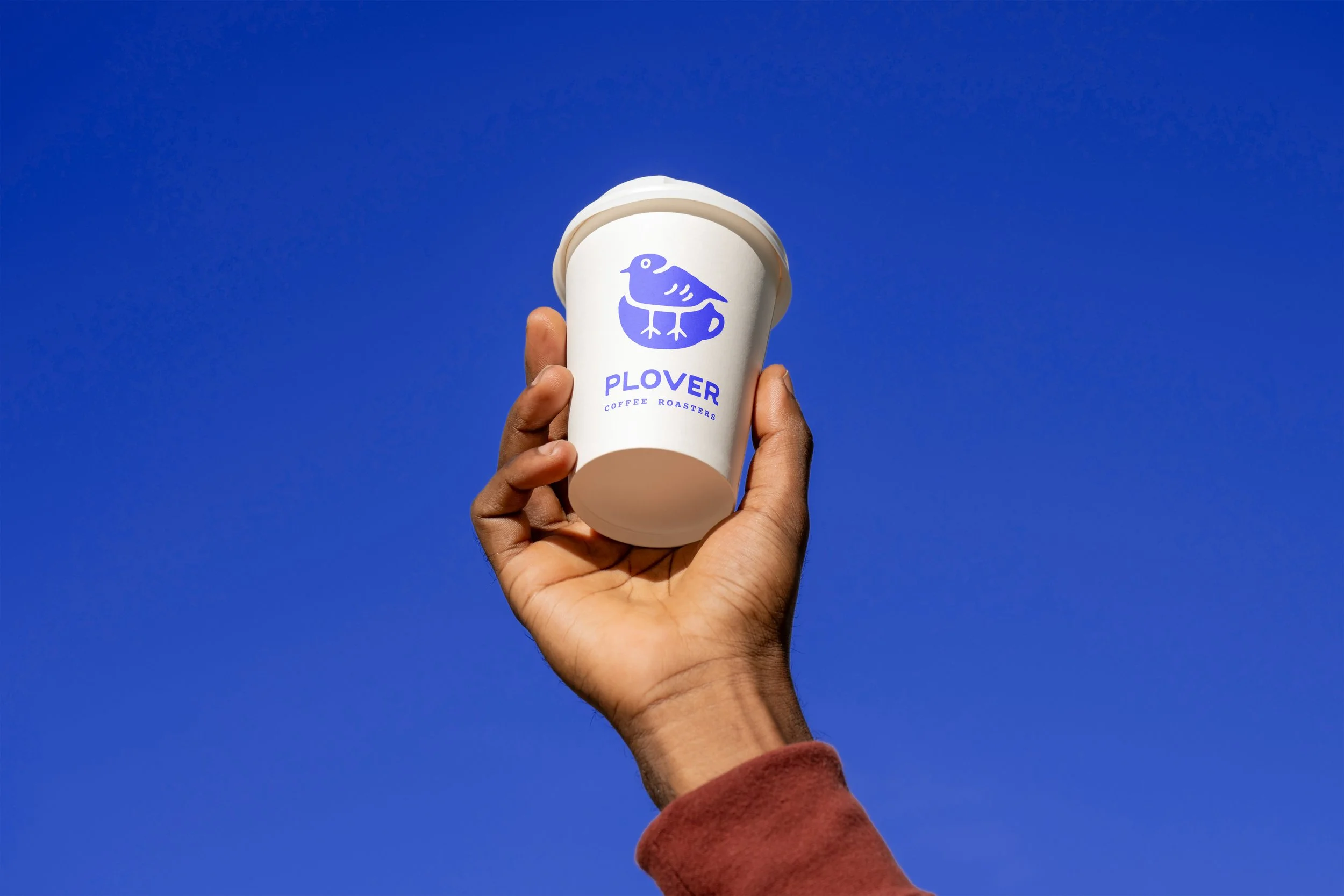
The visuals focused on the snowy plover, the namesake of the coffee shop. Nearby beaches serve as nesting sites for these endangered birds.
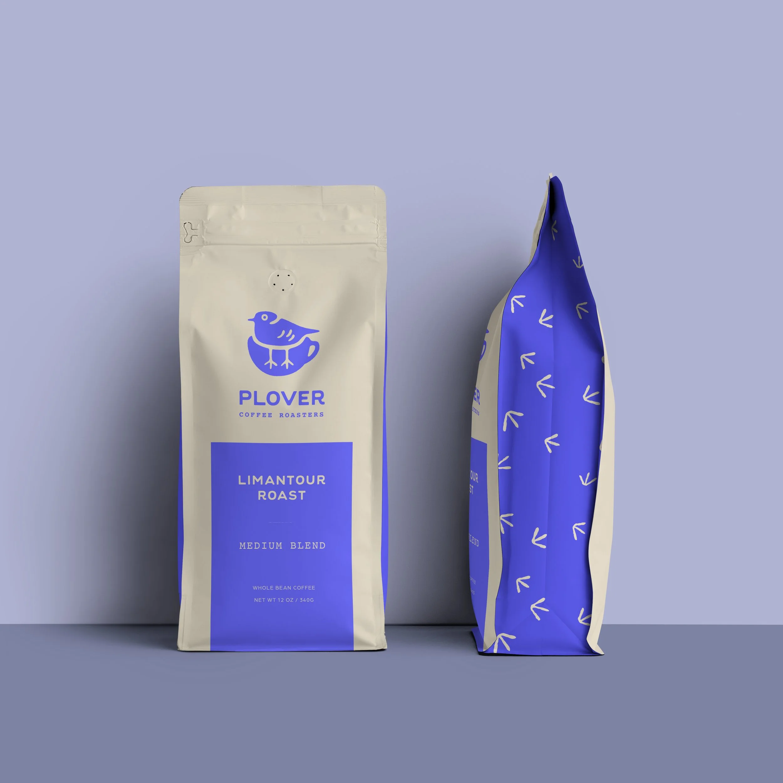
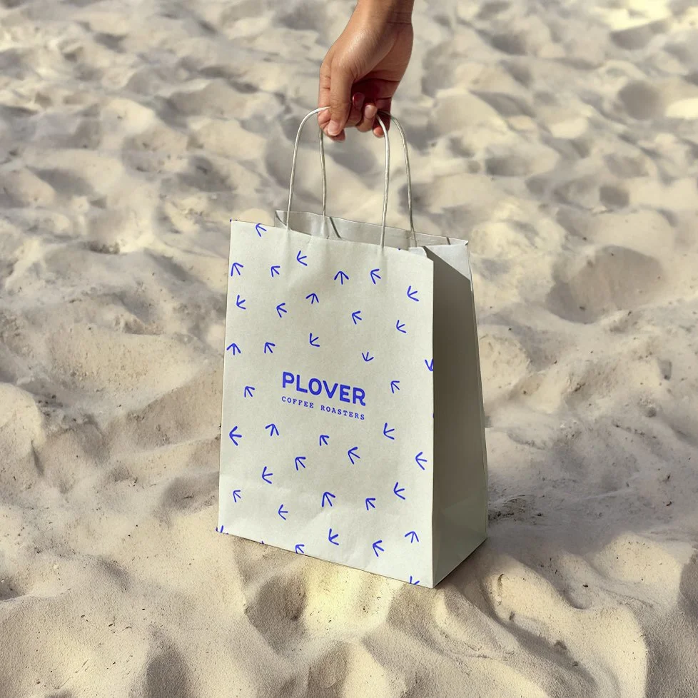
The star of the show, the Snowy Plover, is intentionally featured across all brand visuals. For the logo, I crafted an illustration of a plover nested within the silhouette of a rounded coffee mug. This intentional union between bird and cup mirrors the philosophy of the brand, highlighting the interconnectedness between beings and their environments.
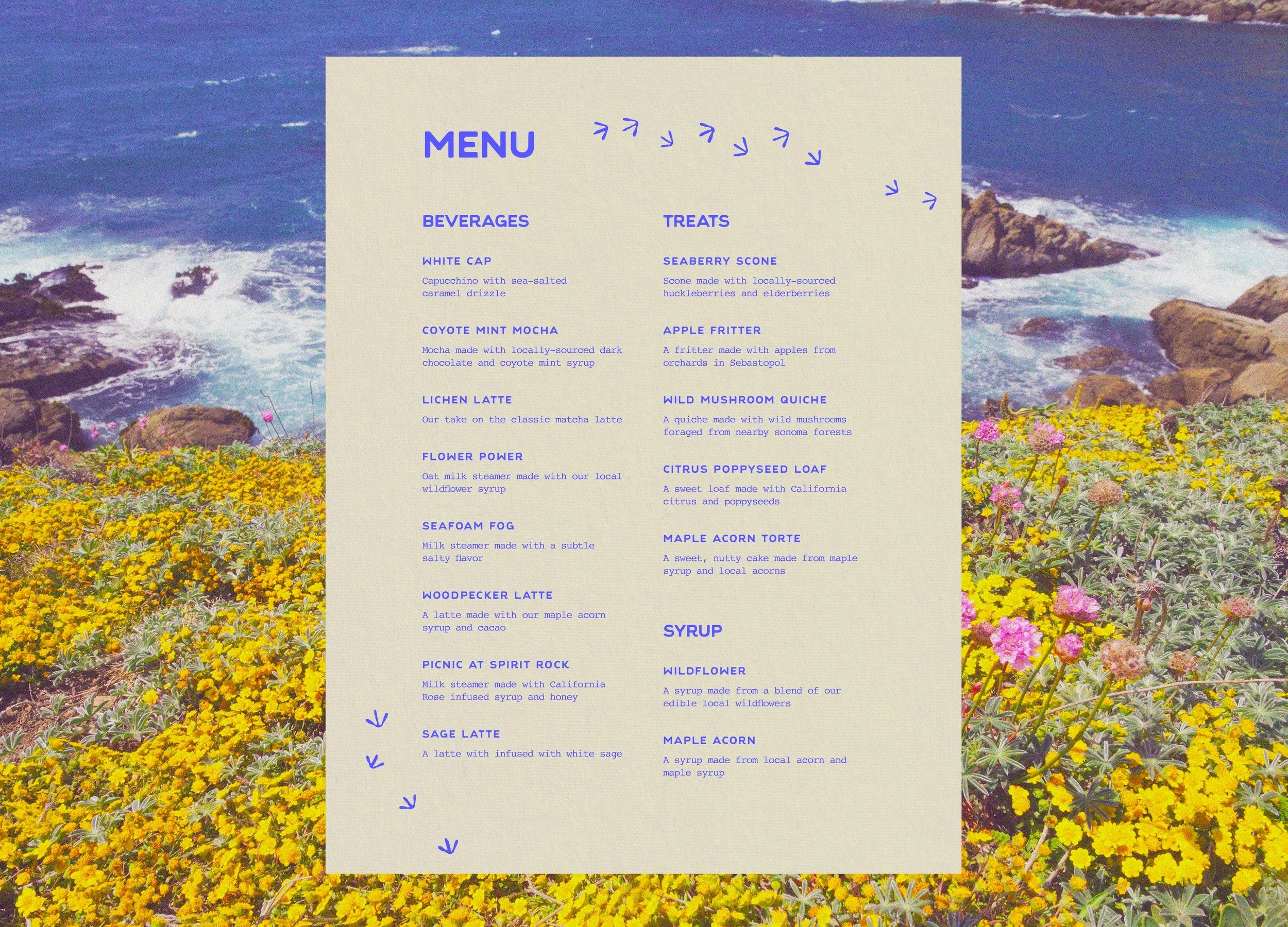
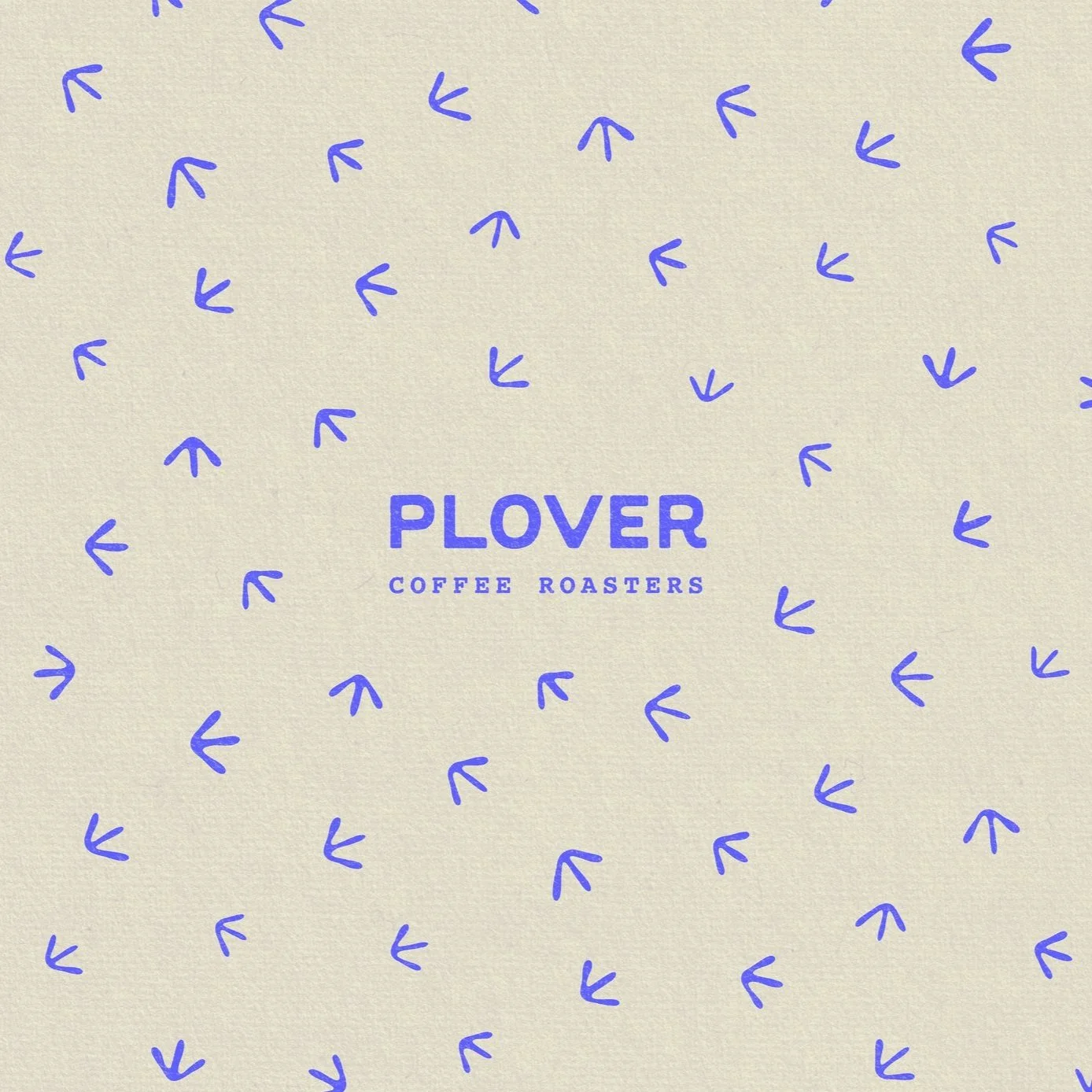
The pattern and accents feature illustrated bird tracks, like those left behind by the plover on the wet sand of nearby shores. These friendly footprints add a dynamic element, mirroring the encouragement of exploration so central to the brand’s values.
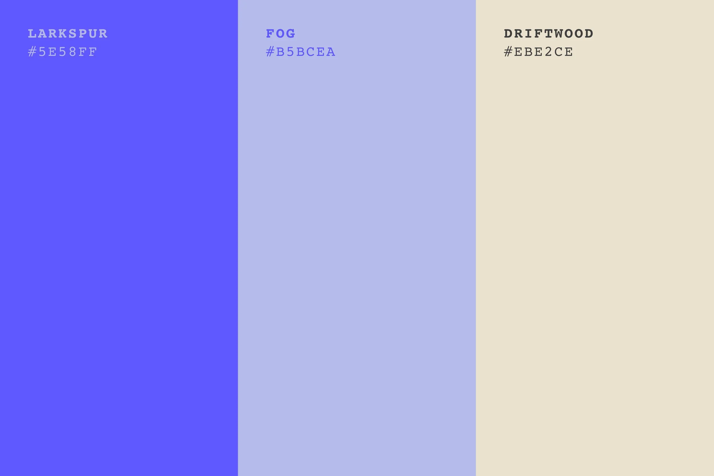
Color Palette
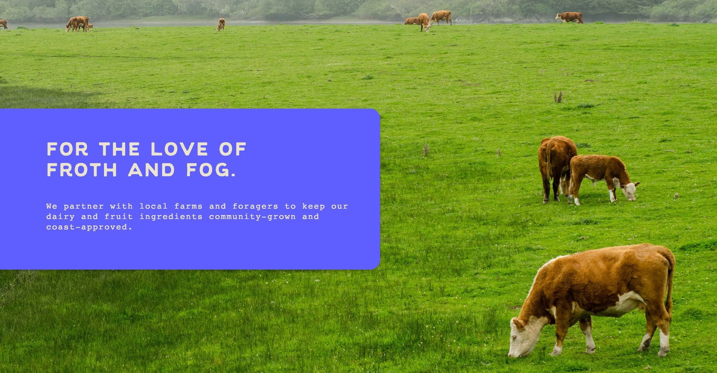
Blues span the Sonoma coast, often tinged with a warm hue from the California sun.
I chose a simple, three-color palette for this project. The colors reflect the vibrant blues of coastline waters and wildflowers, with that special golden-state sunlit warmth. Similarly warm in hue, the beige mirrors the natural, light tones found on a walk down the sandy shores.
Type
A rounded sans serif and a classic typewriter font offer both friendliness and a grounded feel.
For the brand logo and other materials, I used Evergreen as the primary font and Courier as the secondary font. These fonts, together, suggest both a sense of opportunity and presence. Evergreen, a smooth sans serif, creates an open and friendly tone. Courier, a classic typewriter font, evokes memories of old-school printed maps and textured ephemera, reminding the senses of the tactile world around them.
Brand Voice & Tone
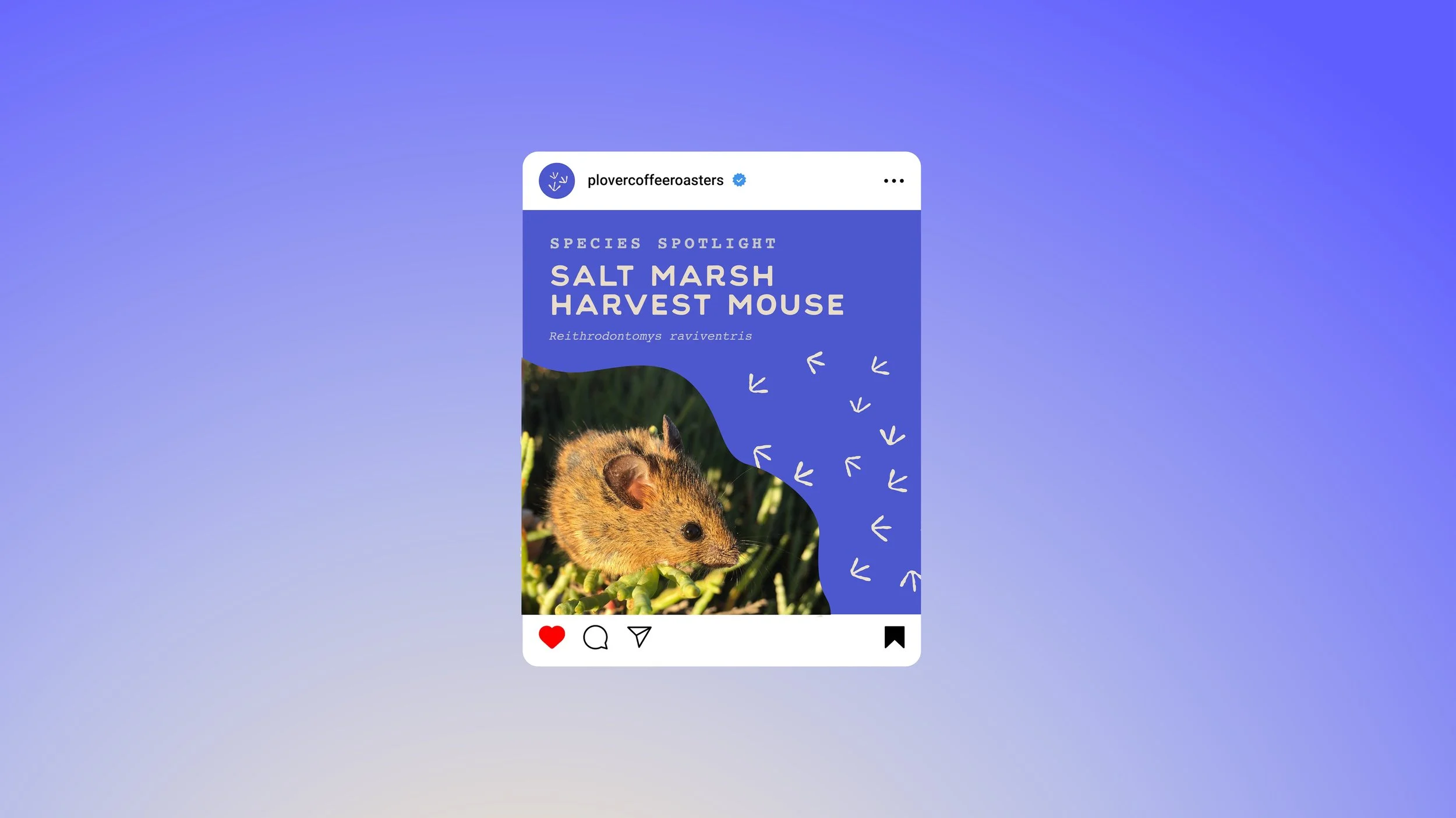
The brand’s tone is ardent and educational, like any good local tour guide.
All brand assets echo the playful enthusiasm behind the brand’s mission. Marketing for the brand is infused with the existing visuals, as well as rounded lines and organic shapes. Taglines offer simple, catchy nods to the brand’s mission. The voice is casual, speaking to each visitor as a fellow human and explorer, and educating them along the way.
Takeaway
Plover is an immersive journey to a land of froth and fog.
This project showcases the depth which can be created when a brand serves to spotlight the local environment and work alongside it, instead of distancing itself. In a unique establishment like Plover, an act of consumption can ground someone in the present moment and bring appreciation to the simple ingredients provided by the earth, while providing energy to explore the physical world.
Plover Coffee Roasters is more than a coffee shop—it’s a sensory immersion into the spirit of the Sonoma coastline. Each sip tells a story of the land and sea. Every visit helps protect what makes the region extraordinary.