College Writing II Course Graphics for Outlier
course design, Illustration | 2022Outlier.org needed a visual identity for their new College Writing II which would build upon the pre-existing aesthetic of College Writing I, their first course in the series, while giving it an updated, distinct aesthetic.

Challenge
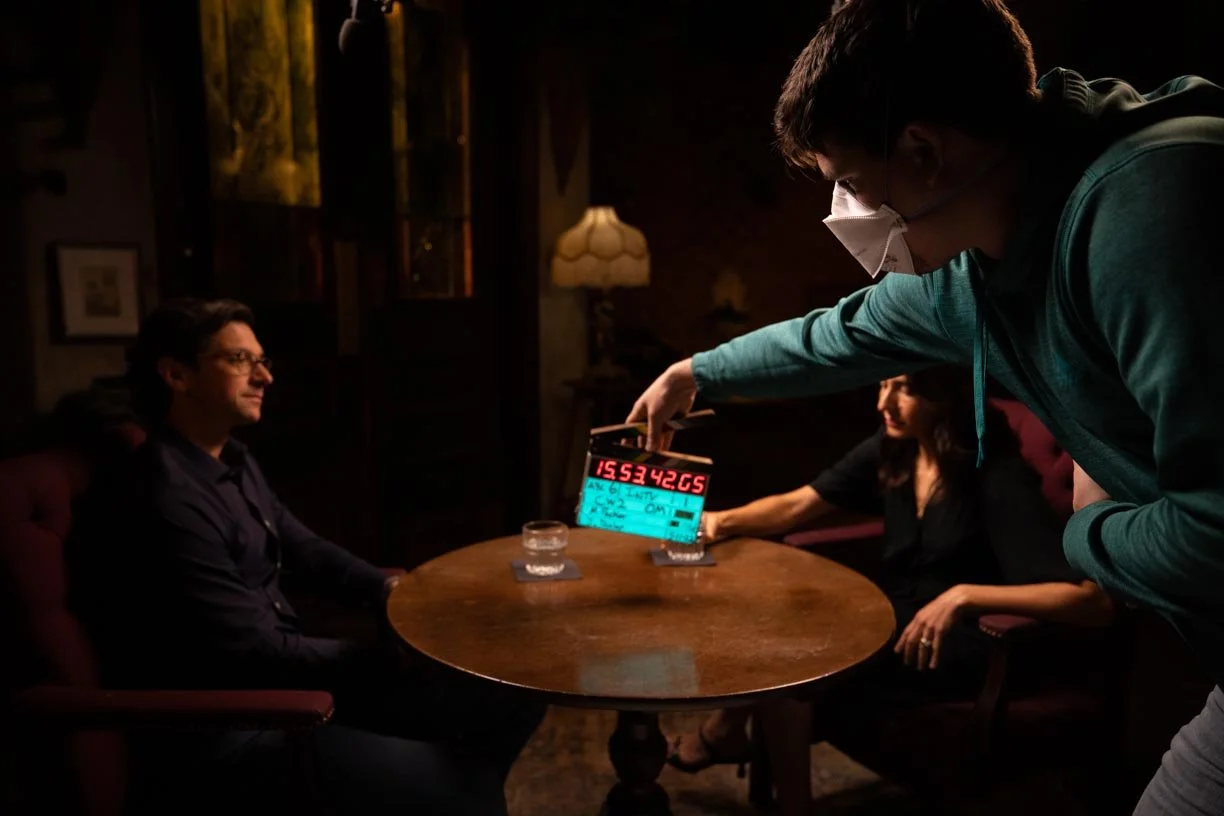
Each Outlier course relies on a bevy of visual aids, such as key terms and illustrations, balanced alongside instructor lecture footage. This course needed a guiding cohesive visual identity to inform design of onscreen visuals while maintaining adaptability for application in a variety of course contexts.
Process
Assessing Content & Tone
The first step was to get a sense of the “personality” of the course content. This course distinguished itself from the previous College Writing I course by employing more complex analogies. The content also included a diverse array of source types, ranging from articles to essays to snippets of non-fiction. Each instructor conducted their lectures with a passionate sincerity, yet also with an enthusiastic youthfulness and wit.
Defining the Design Problem
The more advanced concepts of this course required visual styles which could clearly communicate more abstract ideas. I also wanted the style to maintain the predefined classical, scholarly aesthetic while infusing it with an approachable, youthful tone. I asked: How can I create a widely-adaptable visual identity that contains nods to classical literary tradition while also emphasizing an approachable tone for younger audiences?
I needed to (1) use the scholarly aesthetic of the previous course as a foundation, (2) maintain a balanced tone of both professionalism and playfulness and (3) create a larger base of templates to accommodate the breadth of advanced content.
Solutions
Modern Scholarship Aesthetic
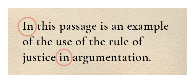
I balanced rough paper textures with clean typography in the final system, creating a scholarly, yet approachable aesthetic. I animated serif fonts in sync with instructor voiceovers, evoking the experience of live literary readings while retaining accessibility.
Professional, yet Playful
I used crisp, black text alongside soft paper textures. I added a slight “wiggle” to black lines to imitate the inevitably uneven bleed of ink on soft paper. I created animations with a lively, personable feel. I maintained a tone of sophistication while providing a warm sense of person-ability to keep students feeling connected to the course.
Flexible Framework
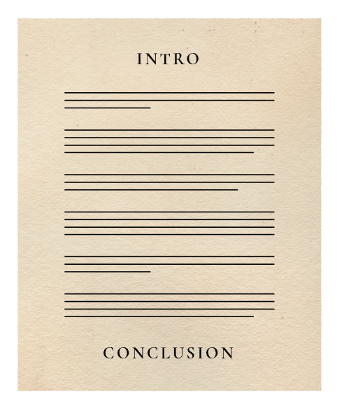
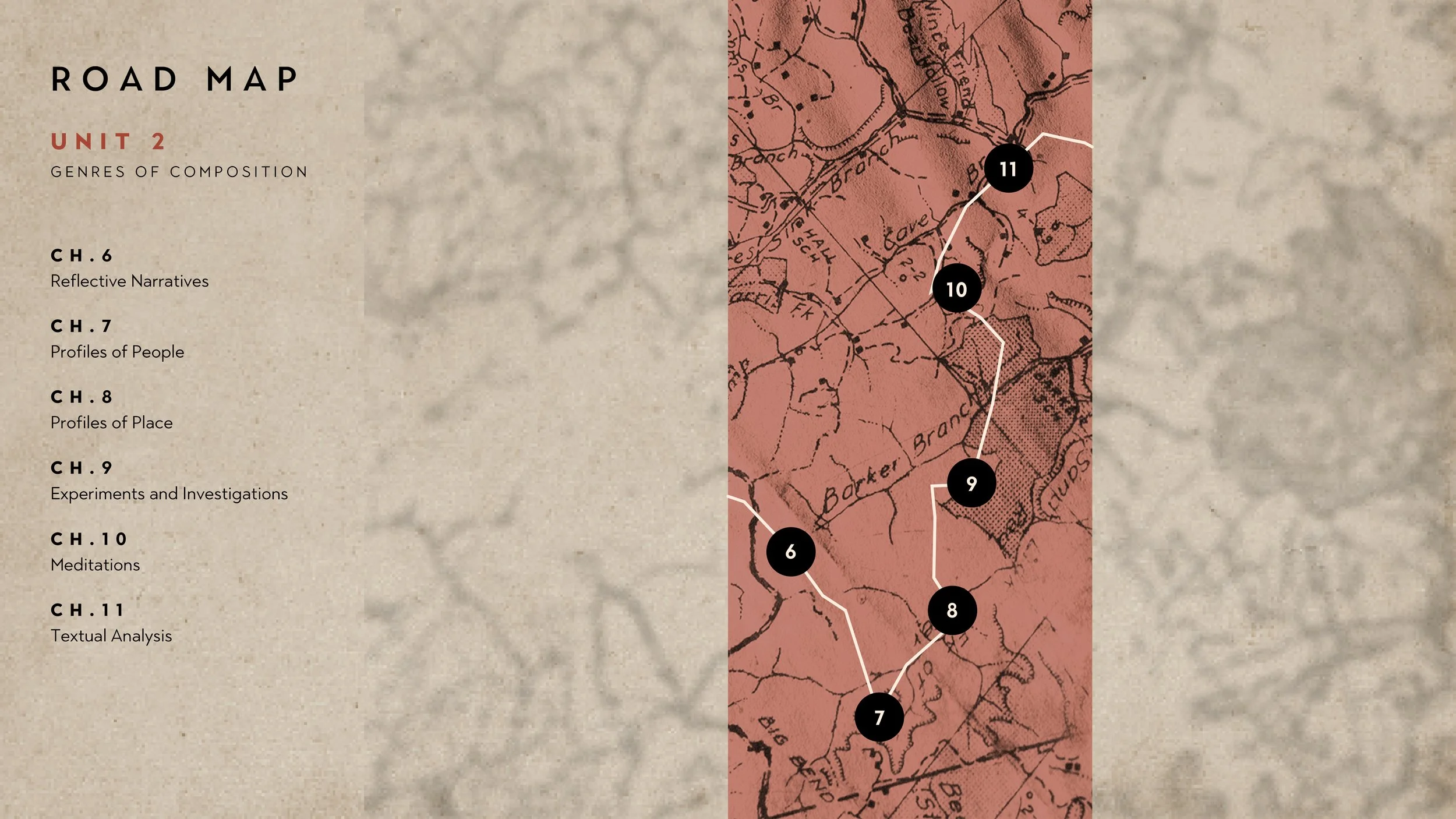
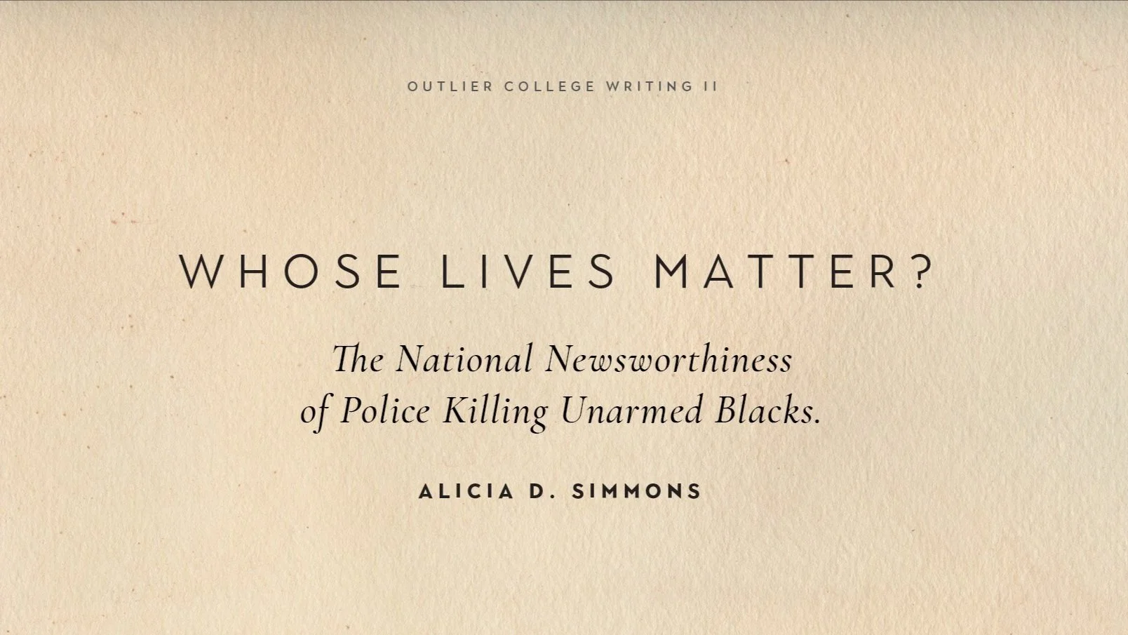
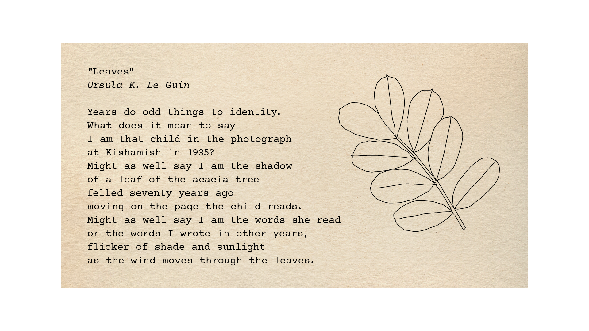
I opted for an adaptable visual framework. This allowed me to make each course element feel cohesive yet curated to course content. I built a comprehensive template system for different visual needs—quotes, author profiles, literature examples, photographs, and animations.
I worked with rough cuts of the course and continuously refined visuals to ensure they complemented the audio content effectively. I recognized when I needed to modify templates and shifted existing formats to accommodate the content. I maintained consistency while allowing for necessary customization.
Reflection
I successfully created a visual progression from College Writing I to II which brought students through an increasingly complex journey of literary analysis and imaginative storytelling. I developed a diverse set of cohesive graphics that balanced old and new aesthetics, lending familiar yet elevated vibes to key concepts and passages.
Key Learning
This project taught me that effective educational design requires the visual system to embody the learning journey itself. I discovered the most successful approach involved aligning the course's visual personality with its educational goals, ensuring I designed something that appealed to learners while honoring the individual character of the content and approach of instruction.