Sociology Course Graphics for Outlier
course design, Illustration | 2021Outlier tasked me with creating a visual identity for its Intro to Sociology course. I collaborated with the lead designer to develop a course aesthetic and produce digital assets that would supplement on-screen instruction.

Challenge
Outlier courses include a diverse array of learning content from a wide variety of sources. I needed to design a visual style which support this material, ranging from textual references to data-based infographics.
Process
Understanding the Material
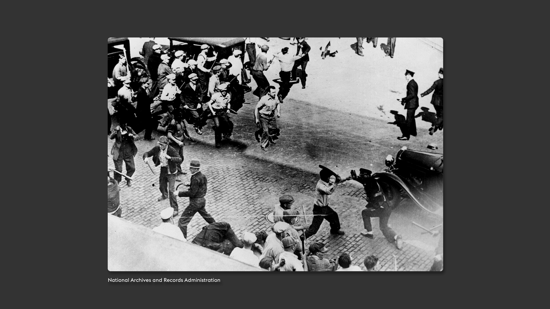
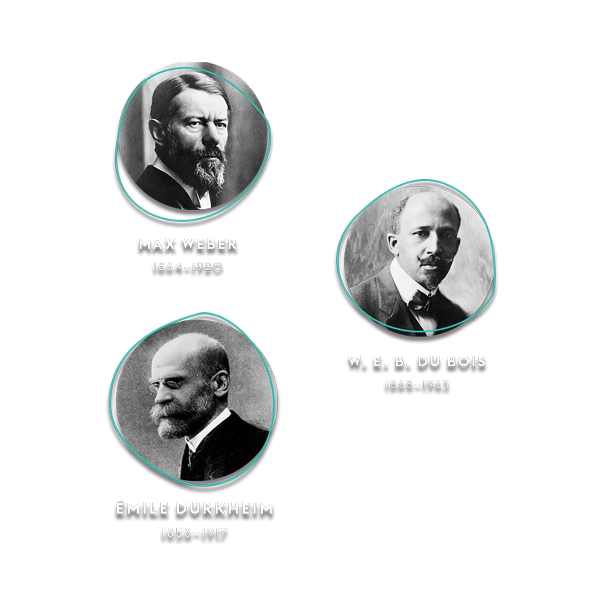
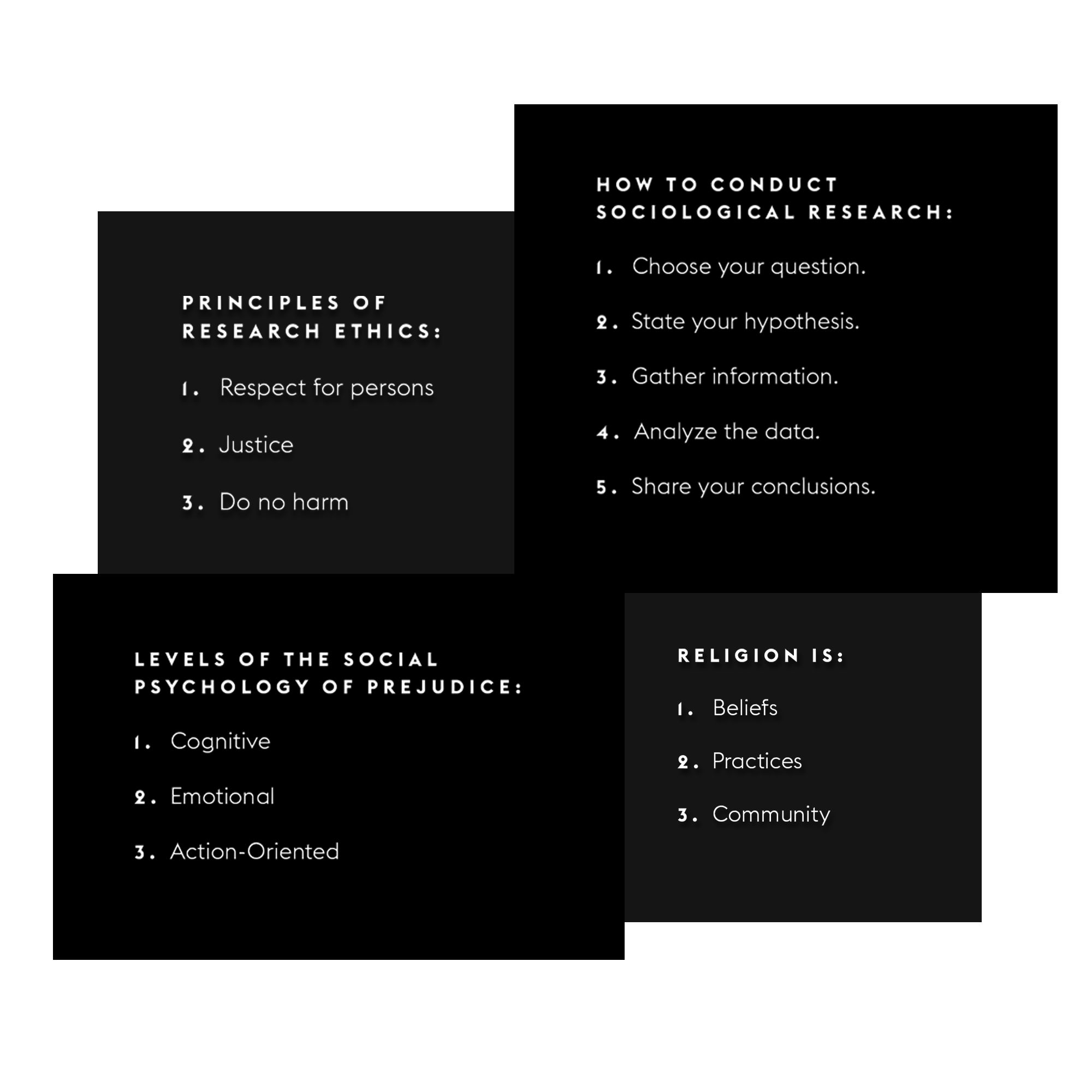
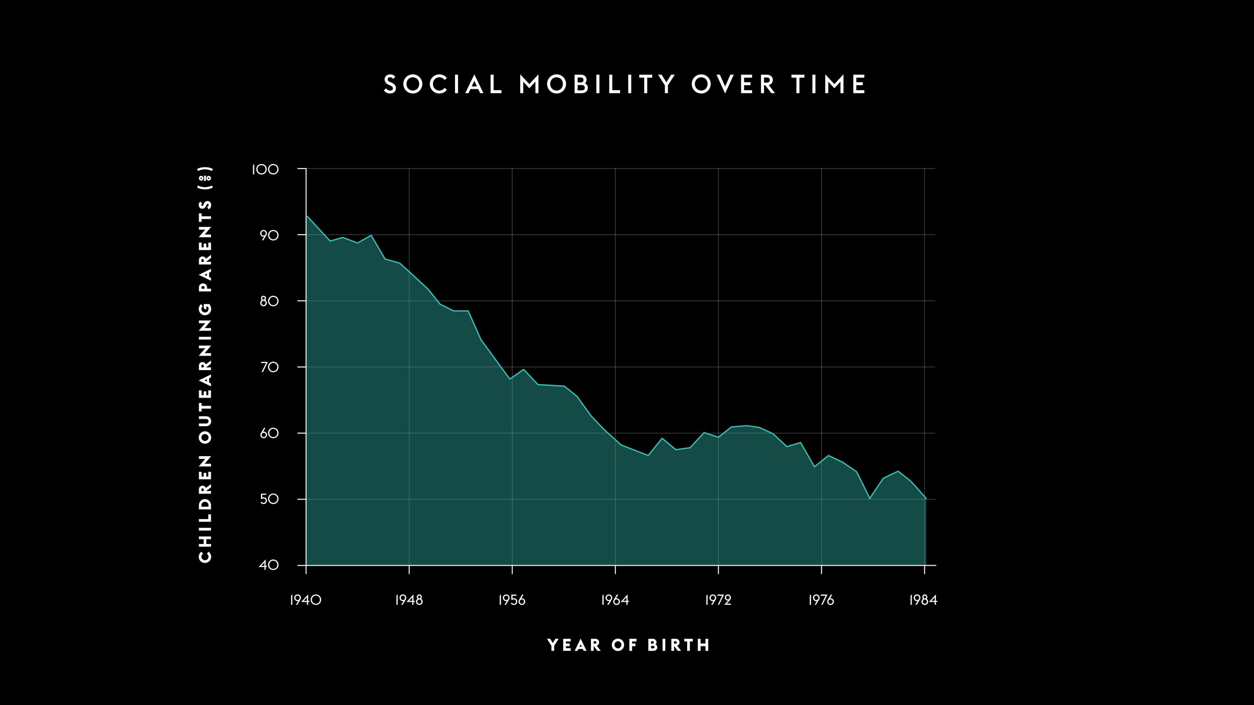
I explored how Intro to Sociology guides students through human society studies using varied content—key concept explanations, statistical data, historical narratives, and photographic evidence. I recognized this breadth demanded flexible visual approaches that could adapt to different information types.
Identifying Core Tensions
I faced a critical design challenge: How do I create graphics that address complex human dynamics and sensitive historical events with appropriate respect while maintaining Outlier's professional yet personable brand voice? I needed visuals that could seamlessly shift between taking center stage and providing background support depending on the content's needs.
Solutions
Establishing Visual Hierarchy
I took an approach of keeping graphics “bare bones” when accompanying visually-complex photographs, yet robust when showcasing complex data sets via charts and graphs. This created a balance where graphics worked appropriately in tandem with course content.
Balancing Sensitivity with Engagement
I tackled the challenge of conveying serious sociological concepts without trivializing important issues. I created graphics with personality that could engage students while respecting the gravity of the subject matter.
Developing a Visual Language
I chose to pare down graphics to minimal but sophisticated styles. I placed images and visuals unframed against black backgrounds, used clean sans serif typography for straightforward textual information delivery, and developed icons and illustrations in varying teal shades with white strokes. This approach provided an attractive, yet balanced aesthetic.
Reflection
I delivered a comprehensive set of graphics that successfully addressed complex sociological topics with both sensitivity and an engaging tone. The visual system I created allowed content and aesthetics to work in harmony rather than competition.
Key Insight
This project revealed to me the strategic power of intentional visual restraint. I learned that effective educational graphics must master the art of knowing when to speak and when to listen—serving as accent pieces when other elements lead, then confidently taking center stage when their moment arrives. Mastering this balance enabled me to create a visual system where important sociological concepts could reach students without visual interference or overshadowing.