Editorial Design for the Mellon College of Science
Editorial Design, Project Management | 2025Tasked with redefining the publication for the Mellon College of Science, I aligned its visual identity with the university’s evolving brand while overhauling a fragmented production process.
Opportunity
Every year, the Mellon College of Science publishes a magazine to showcase leading research and college-wide updates to a broad alumni audience. However, the existing aesthetic was outdated and the production process felt disorganized and inefficient. My goal was twofold: create a visual language that felt as cutting-edge as the science inside and design a workflow that respected the time of the experts involved.
Challenges
Designing for a university means balancing a lot of brilliant voices. Between faculty, researchers, and marketing teams, the revision cycle struggled under a surplus of edits with a lack of a unified organization system.
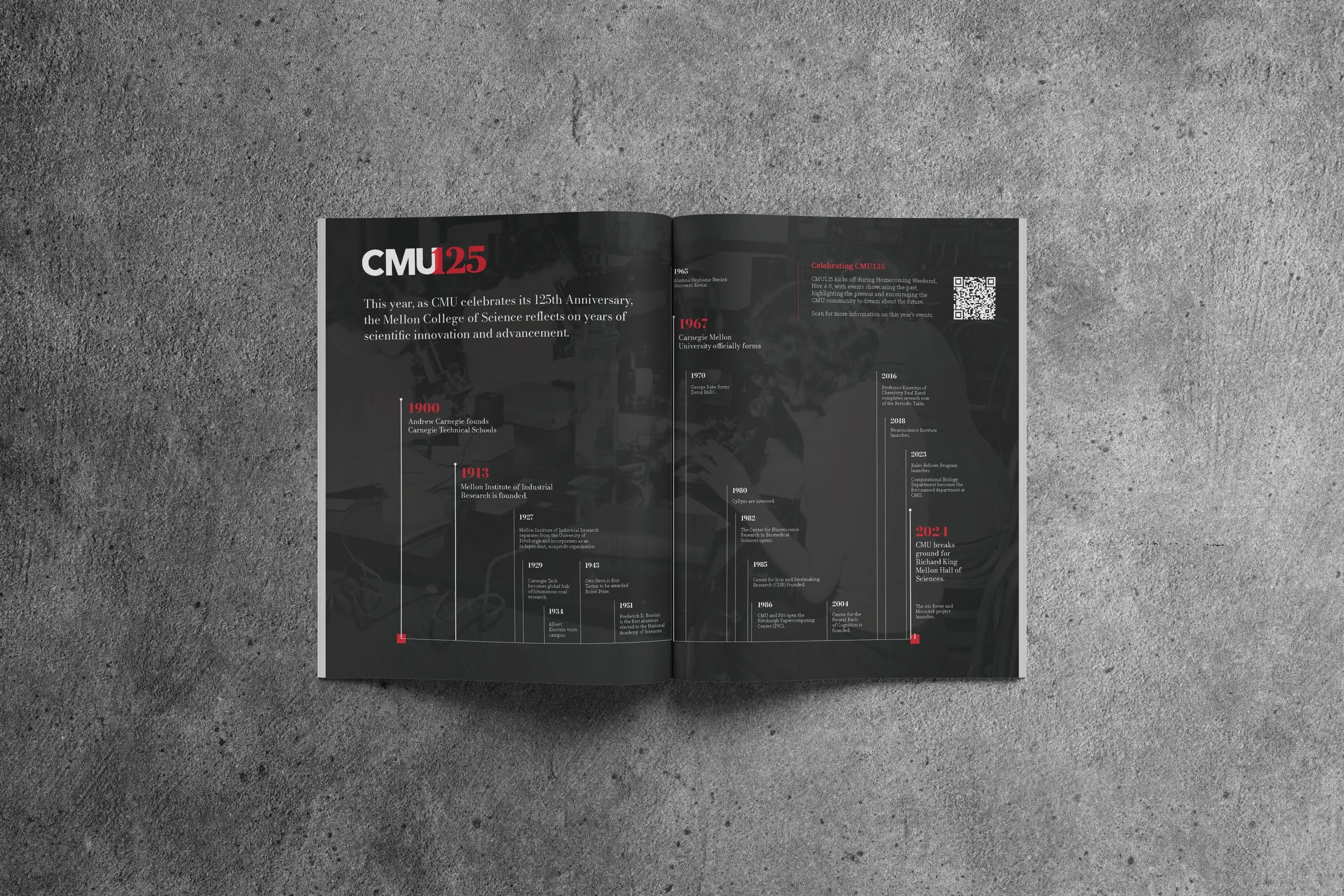
Updating Aesthetics: In 2025, CMU moved toward a sharper, more minimalist visual style. I saw this as an opportunity to update previous publication precedents and align the college visually with the larger university.
Coordination Chaos: With content, revisions, and last-minute changes coming from a variety of faculty and staff, keeping tabs on every update felt unmanageable and disorganized.
Strategy
To solve the communication gap, I transitioned the team from a combination of written and emailed revisions to a live editing software.
Live Collaboration: I implemented Adobe’s "Share for Review" function, allowing faculty to provide feedback directly on the pages, and could update changes as they were proposed.
Transparent Tracking: I built a unified tracking system to ensure everyone on the team knew exactly where an article or graphic stood in the pipeline.
When pivoting to a new aesthetic, I referenced the new CMU brand changes and its distinct design shifts. I noted changes such as modifications to typographic styles, pared-down use of non-primary brand colors, and clean, sharp visual accents.
Aesthetic Alignment: I incorporated this pivot in university branding by matching the university-wide use of its serif font for headings, using mainly red and grayscale for color, and including sharp, geometric fills for flourishes.
Solution
The 2025 issue was delivered with significantly less friction and an elevated aesthetic. By improving collaboration processes and creating more stylistic cohesion, I increased team-wide efficiency and defined a new visual direction to be used for years to come. My biggest takeaway? A designer's best tool isn't always the Pen Tool; sometimes, it’s a perfectly optimized process.