
Overview
Client: 3RPrep
Ask: Update existing company branding, including creation of a new color palette and logo.
My Role: Graphic Designer
Context
3RPrep is a well-known tutoring company within its area. Many local parents entrust the company in the task of properly preparing their children for college and the greater world of test-taking. However, 3RPrep’s branding was not catching the attention of its client base. 3RPrep needed the visual representation of their business to reflect their results-driven and reliable service. They were in need of a new branding palette and a fresh new logo.
Scope
The client had two requests: to maintain use of American Typewriter as the logo/brand typeface, and to stay mostly loyal to the current colors of their brand: red, black, and white.
Rationale
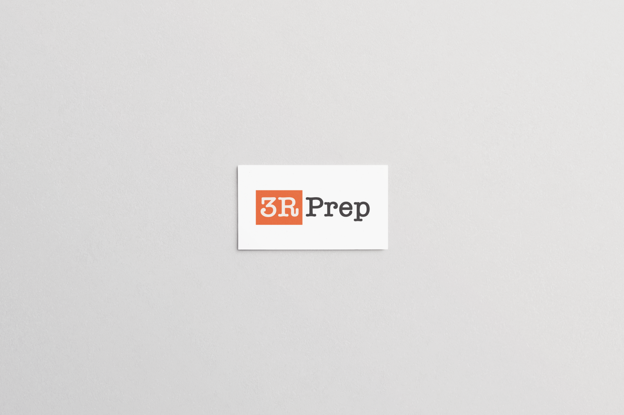
The company’s past logo and branding featured a maroon-red. I found something fresher, something a little more exciting which could more easily speak to the company’s youthful clientele. I opted for a red with strong orange tones. Then, I followed suit by slightly altering the tones of the other colors. I shifted the black to a deep charcoal grey. The white became a creamy-beige. Gone was the high-contrast, standard-colored palette. Hello, new beautiful set of bright, eye-catching colors.
The logo required a new take on a traditional and well-established standby–the American Typewriter font. I found a more up-to-date typeface from the family and used it in the logo. This, combined with the chosen branding colors and a simple square background (pictured below) distinguishing the two key parts of the logo, “3R” and “Prep” respectively.
Impact
The client was ecstatic with the final choices for branding colors and logo. The company was able to retain some older key visual identifiers for their brand, while also upgrading them to align more properly with their modern business.
